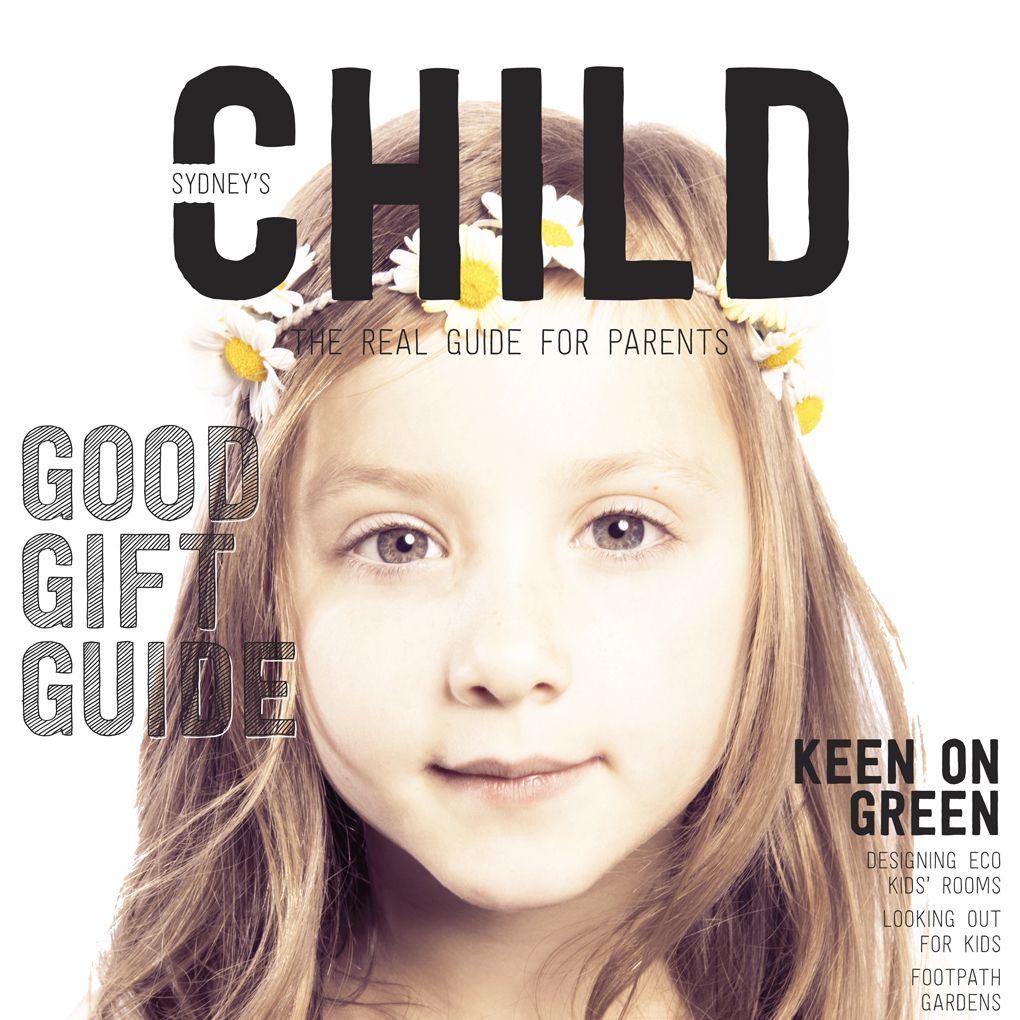
When I started at CHILD Magazines in Sept 2013 as Editor, the magazine was in need of a redesign. This was our first redesigned cover – November 2013. The cover kid, Chelsea, is a friend of my daughter Scarlett. She has a great spirit and an other-worldly vibe, perfect for our first eco themed issue.
The goal of the redesign was to zig because every other parenting magazine zags – that meant avoiding the mish mash of bright colours and babies in tulle headbands you typically see on parenting magazine covers. Parenting mags are for grown ups, and it was time for CHILD to also ‘grow up’ and be more discerning, modern and visually stunning.
On our covers, the child is the hero because our vision is to be ‘every child’s champion’. We chose a strong masthead because we produce strong articles (more on that later), and I wanted it to look hand drawn, just like we did back at school on our folders.
The third cover element is our coverlines which we love to play with – using different fonts, hand drawn elements and content that has fun but also importantly, questions parenting taboos.
This cover won GOLD at the international Parenting Media Awards which made me feel pretty darn good.
